SC Awards UX Case Study
Designing clarity, intent, and urgency for a data-driven, multi-audience platform
Product
SC Awards (SC Media) https://www.scworld.com/sc-awards
Role
UX Designer & Researcher
Timeline
14 days


Product
SC Awards (SC Media) https://www.scworld.com/sc-awards
Role
UX Designer & Researcher
Timeline
14 days
The SC Awards platform powers one of the cybersecurity industry’s most established recognition programs, supporting a diverse audience that includes vendors, practitioners, judges, and sponsors. Visitors arrive with clear and time-sensitive goals such as submitting nominations, reviewing finalists, participating in judging, and assessing the credibility and impact of the awards. The platform must balance authority, clarity, and efficiency to support confident decision making.
Despite its authority and content depth, the SC Awards page places unnecessary cognitive strain on users at critical decision moments.
False affordances: A paragraph-level text element accounted for over 3% of all clicks despite being non-interactive, indicating misleading styling and broken expectations
Shallow engagement: Nearly 60% of users never scroll far enough to see essential information, signaling poor above-the-fold prioritization
Over-reliance on navigation: High interaction with dropdown navigation suggests users do not find answers within the page itself
Heuristic Evaluation: I evaluated the SC Awards page against established usability principles, focusing on hierarchy, affordances, visibility of system status, and efficiency of use.
Behavioral Data Review: Click and scroll data were analyzed to validate usability issues and identify where users disengaged or misinterpreted interface elements.

Caption: Heat map provided by CRA Data & Analytics teams.
Enable faster, more confident user decisions by clarifying hierarchy, aligning navigation to user intent, and elevating critical, time-sensitive actions.

Design Response:
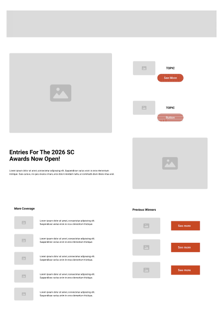
A concise “How It Works” section and clearer CTA labeling were introduced above the fold, reducing uncertainty and encouraging deeper engagement.
