01 / Typography
Bold names establish the first reading level. Smaller role text adds context, while blue affiliations connect each speaker to their organization.


CyberRisk Alliance / Event identity & editorial design
A distinctive event identity and a clear sponsorship story for a nationwide virtual cybersecurity conference.

The event needed to stand out in a crowded cybersecurity market while speaking to government security leaders and prospective sponsors.
I developed the identity and sponsorship prospectus to connect a memorable visual direction with a readable sales story: event information, agendas, speaker profiles, and sponsorship details.
01 / Visual direction
The Capitol and illuminated circuit-board imagery create a direct connection between public-sector leadership and cybersecurity. A navy foundation with blue and violet accents gives the event a recognizable visual language.
Imagery & art direction. The source artwork is from Adobe Stock. My contribution brings that imagery into the event system through composition, typography, color, and layout, with quieter interior pages balancing the intensity of the cover.

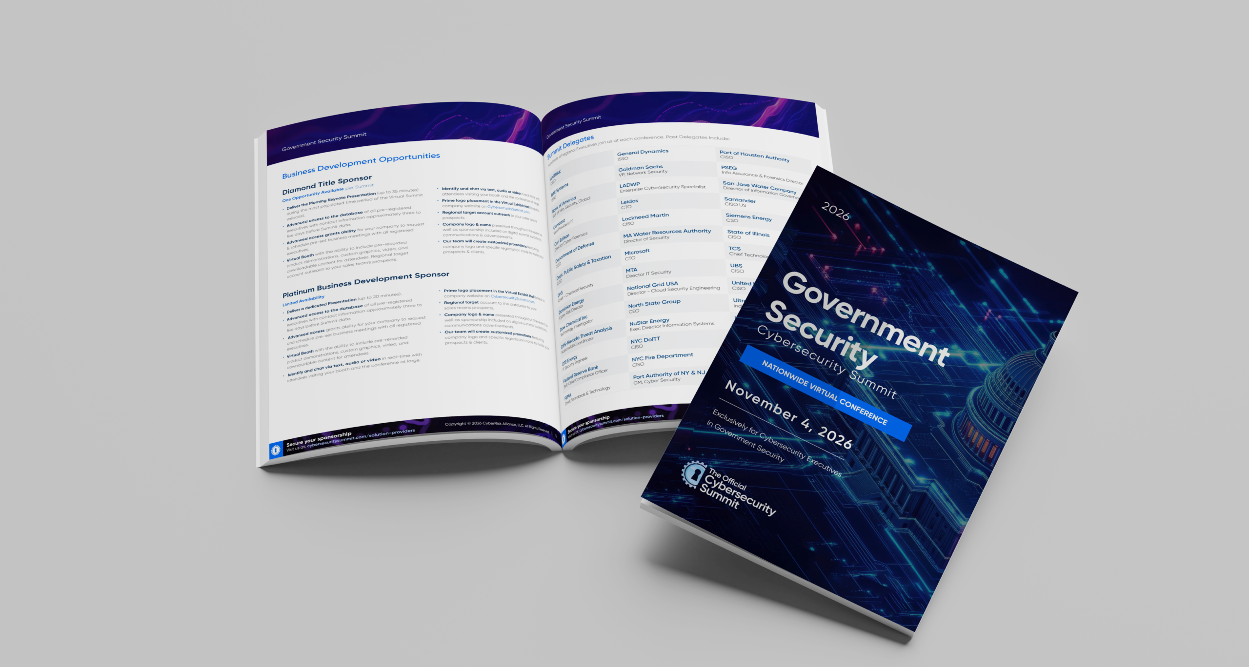
02 / The prospectus
The prospectus brings event information, the agenda, and speaker and partner profiles into one visual system. Strong headings and repeated layouts give each type of content a clear place.
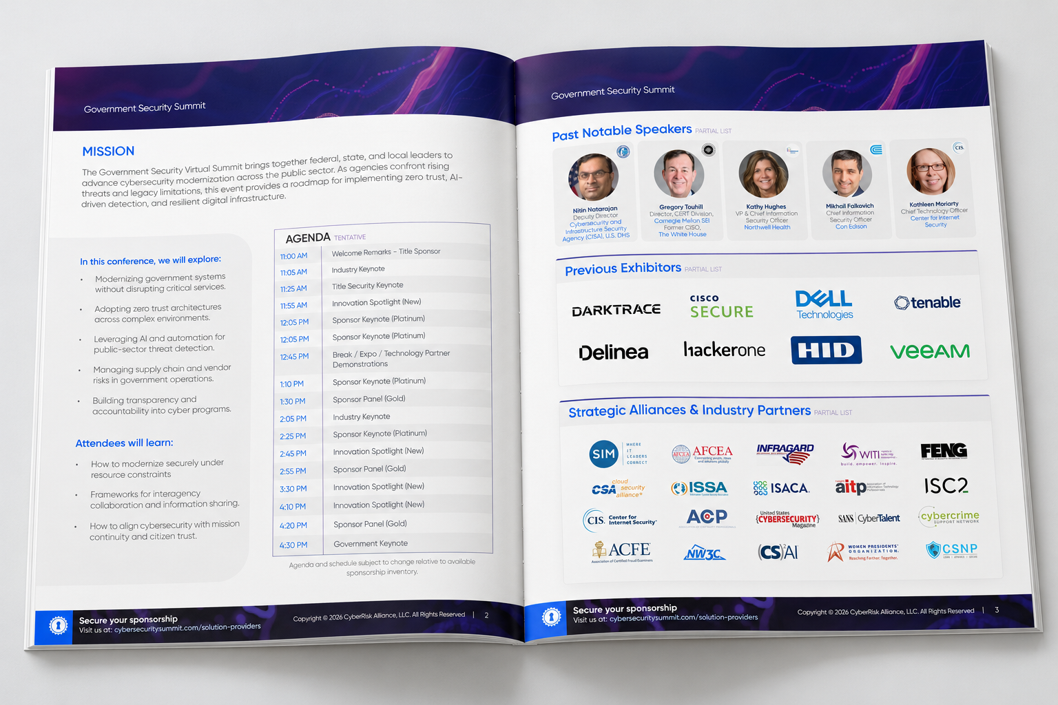
Detail / Speaker profiles

Bold names establish the first reading level. Smaller role text adds context, while blue affiliations connect each speaker to their organization.
Equal-width cards and repeated gaps create a steady horizontal rhythm. Consistent portrait sizing and aligned name positions make the profiles easier to compare.
Behind the layout
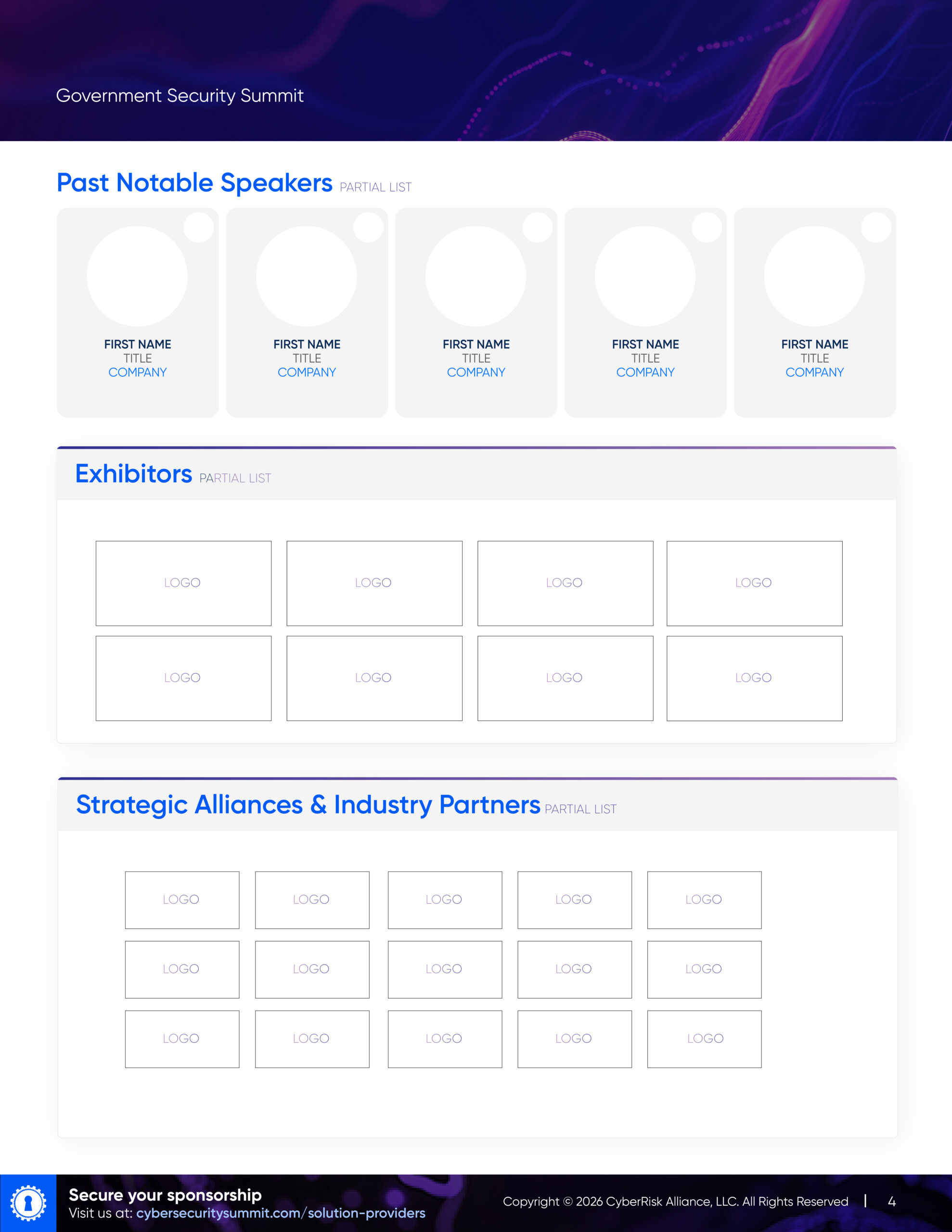
Consistent columns align speaker portraits, names, and supporting information.
Blue section headings lead the page, while bold names and smaller role labels establish a clear order within each speaker card.
Speakers, previous exhibitors, and strategic partners occupy distinct blocks so their roles stay clear.
I used consistent spacing as a guiding principle in the implementation, repeating gaps within cards and between content groups to establish a predictable visual rhythm.
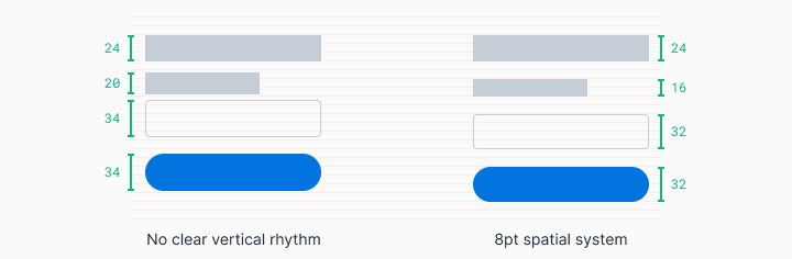
Layout principles / Reference diagrams
These reference diagrams explain two useful foundations: consistent spacing creates rhythm, and columns provide a flexible framework for arranging content.


Reference diagrams: Elliot Dahl, Space, grids, and layouts, Design Systems by Figma. These illustrate general principles; the project layout is shown above.
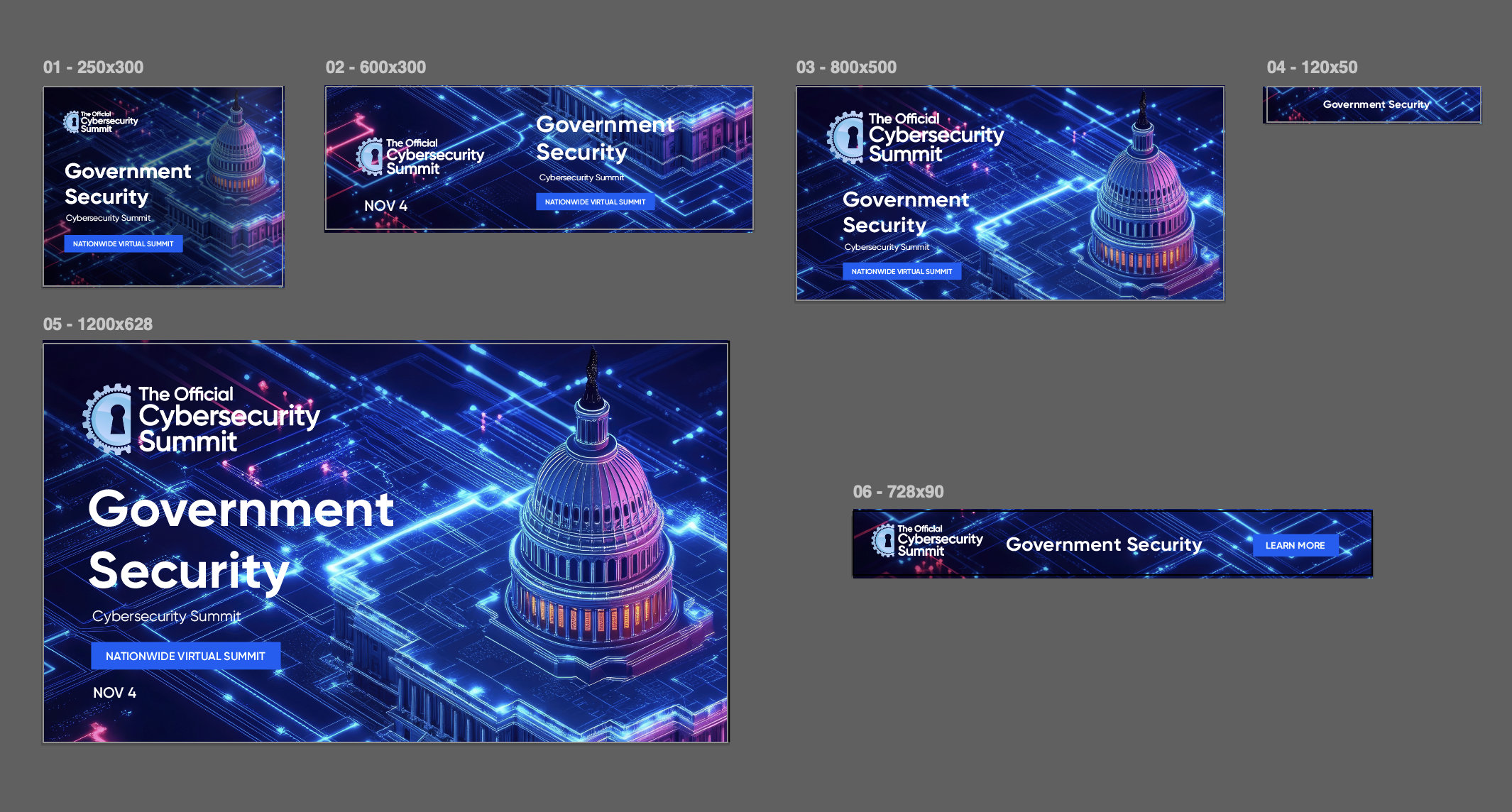
03 / Campaign applications
The composition adapts across campaign graphics and banners while keeping imagery, typography, and event messaging consistent.
04 / Delivery & outcome
Reported event revenue performance.
I delivered the event identity and art direction, sponsorship prospectus, agenda and speaker layouts, and campaign graphics. Together, these materials gave the team a consistent way to present the event and its sponsorship opportunities.
The revenue result reflects the event’s overall performance across sales, marketing, programming, and design.
05 / Digital concept
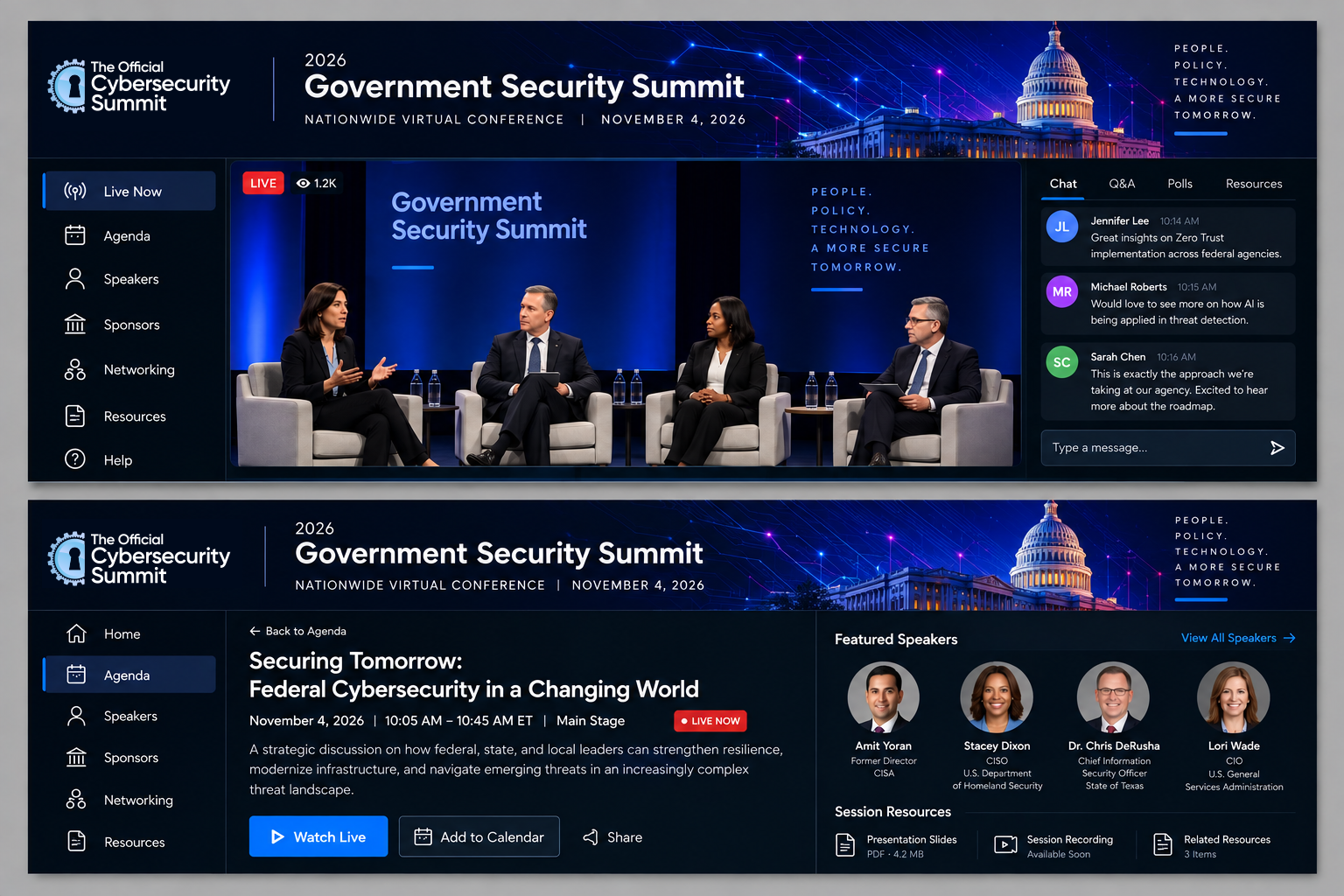
A virtual event interface concept explores branded session headers, agenda navigation, and speaker information. This is a design exploration rather than a launched platform.