• Home
  • About me
  • Branding
  • Services
    • Editorial
    • Digital
    • Motion Graphics
  • Case Studies
  • Clients
  • Contact
  • Home
  • About me
  • Branding
  • Services
    • Editorial
    • Digital
    • Motion Graphics
  • Case Studies
  • Clients
  • Contact

Next ON

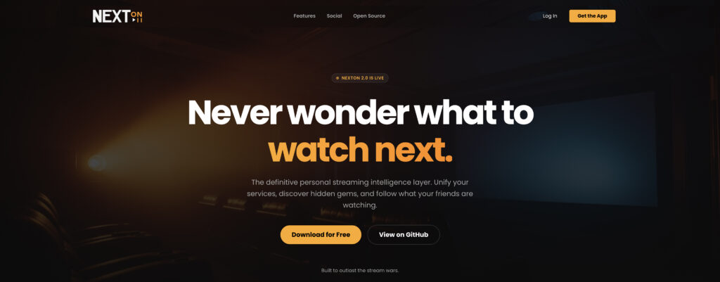
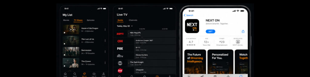
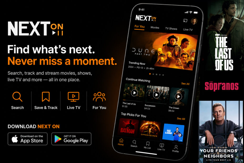
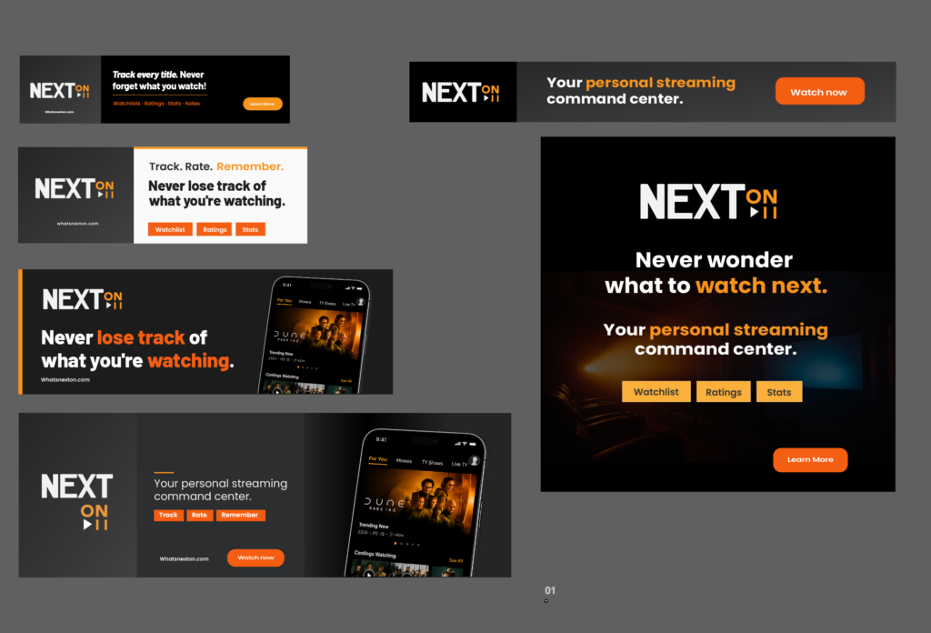
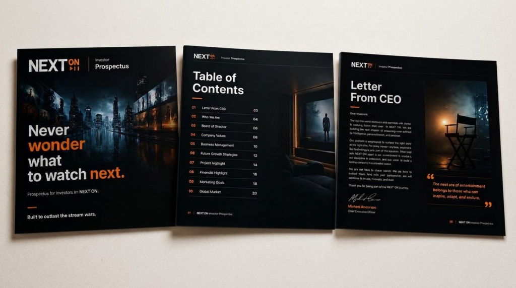
A dynamic digital brand built around layered photography, bold typography, and a high-contrast color system. The design communicates immediacy and innovation — ideal for a fast-moving digital platform. The layered composition technique brings depth and energy to every touchpoint, from app screens to promotional materials.

CATEGORY
Branding, Product Design
Client
Next On
Date
August - November, 2024

NEXT on required building a brand and product identity from the ground up. The challenge was creating a visual language that felt native to the app environment while establishing enough brand equity to stand on its own across marketing and product surfaces.

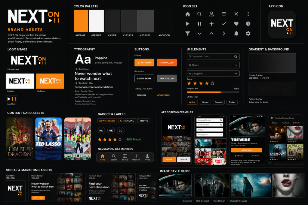
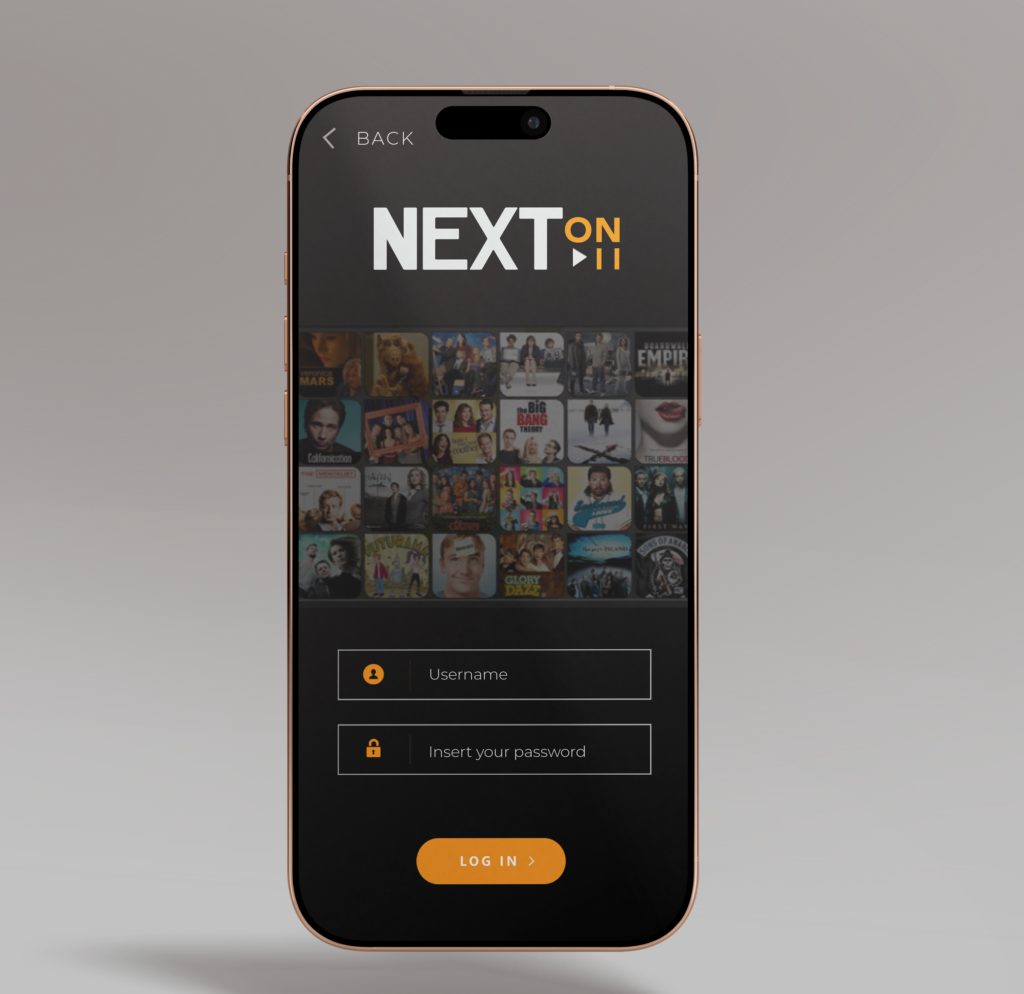
The work spanned the full brand system — logo design, color palette, typography, iconography, and UI design — ensuring a cohesive experience from the app interface through to all external-facing marketing materials.

Core Functions

Social Watchlists let fans share lists directly with friends, turning viewing from a solitary habit into a shared one. Instead of scrolling reviews from strangers, users see what people they actually trust are watching.

AI Watch Insights study viewing patterns, genres, directors, formats, and turn them into personalized guidance on what to watch next.

The Problem

Entertainment is scattered across a dozen platforms, but the conversation around it never was. Fans still wanted to know what to watch next and what their friends were into, but no single app tracked across Netflix, Hulu, and everything else. NextOn was built to close that gap.

The Mindset

NextOn is built for fans, not algorithms. Most recommendation engines optimize for engagement, not honesty. NextOn optimizes for a clear answer to a simple question: what's actually worth watching next? That meant treating social signal and smart insight as the product, not a bolt-on feature. And because watch history is personal, privacy had to be a foundation, not an afterthought. NextOn is self-hostable and open source from day one.

View here

Platform Integrations auto-import watch history from Netflix, Hulu, and beyond, building a complete picture without manual entry.

Privacy First, Open Source means the code is community-audited and self-hostable, so fans control their own data instead of trusting a black box.

Logo Creation

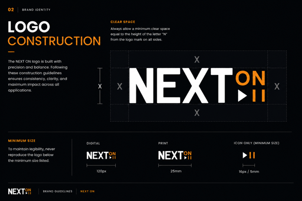
The NEXT ON mark was built around a deliberate tension — oversized letterforms for "NEXT" functioning as a graphic field, with "ON" as a tighter, more refined counter-mark. The orange and off-white palette creates instant contrast on dark backgrounds while the media control icons (play, pause) reinforce the platform's entertainment purpose without being literal. The result is a wordmark that works at app icon scale and at full billboard scale equally well.

Typography

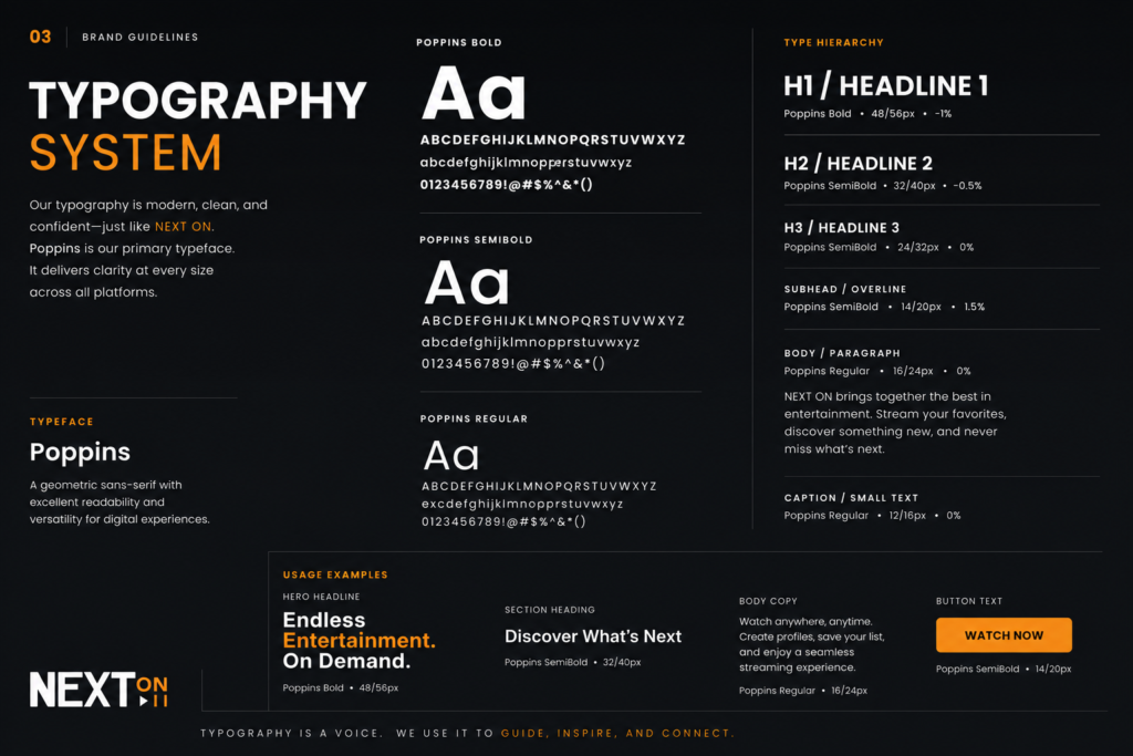
The type system is anchored by Inter — chosen for its performance across screen sizes and its neutrality at small scales, which lets the brand imagery and content do the heavy lifting. Weight variation does the hierarchical work: 800 weight for display and headlines, 500 for UI labels and navigation, 400 for body. Tight tracking throughout gives the system a compressed, cinematic feel that aligns with the platform's tone.

Work Created Includes
  • Prospectus
  • Branding
  • Social Media
  • Logo
  • Banners
  • Adverts
© Copyright 2026 McNamara Graphics. All Rights Reserved
×

Get start

selena

×

Thank you

Your message is successfully sent...

×

Sorry

Something went wrong