


EDITORIAL SYSTEM / RESEARCH PUBLICATIONS
SAJE — Just Recovery Series
Building a flexible visual system for housing research, policy, and advocacy.
THE ASSIGNMENT
One visual language, built to carry a series of complex reports.
Strategic Actions for a Just Economy (SAJE) is a South Los Angeles nonprofit focused on tenant rights, healthy housing, and equitable development. The Just Recovery Series examines housing insecurity during the pandemic and the role of corporate ownership in the rental market. The editorial challenge was to organize detailed research, figures, and policy recommendations into approachable publications with a shared visual language.
Research designed to inform action
The Just Recovery Series examines housing insecurity and proposes community-grounded policies for a more equitable recovery. The publications bring detailed research to tenants, community organizations, advocates, and policymakers.
BRAND FOUNDATIONS
An existing identity. A consistent editorial expression.
SAJE’s established identity provides the starting point: a defined color palette, Interstate typography, and consistent logo usage. My contribution focused on applying that identity across report covers and interior layouts, creating a clear hierarchy for dense research and supplied graphics.
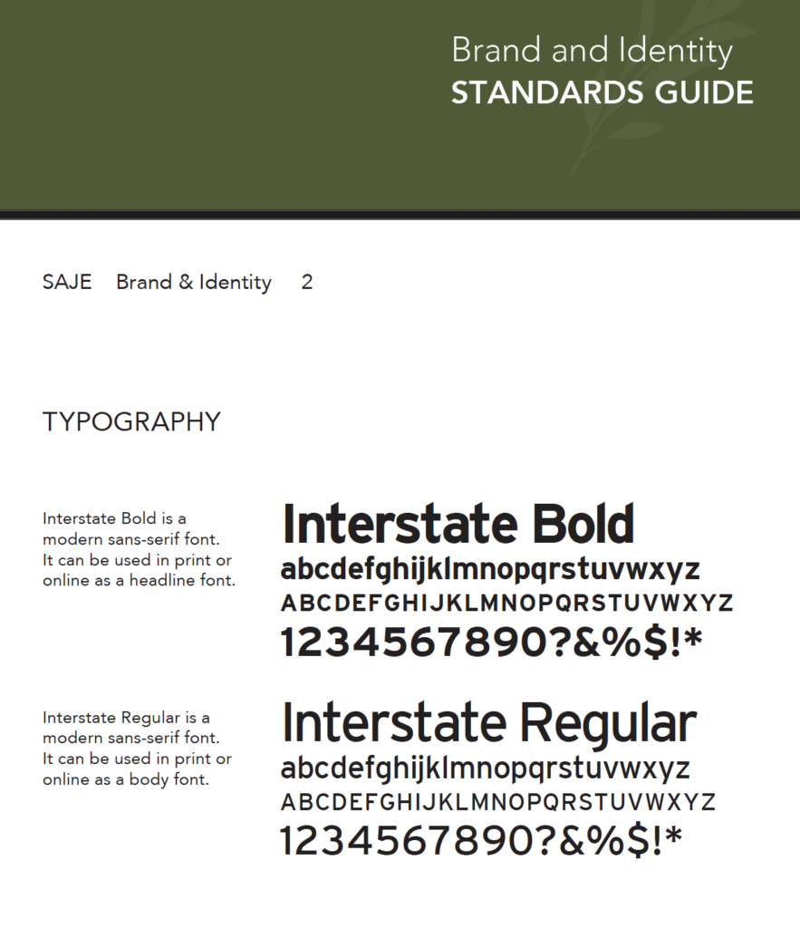
Typography reference from SAJE’s supplied Brand & Identity Standards Guide. Interstate Bold and Interstate Regular provide the typographic foundation for the editorial layouts.
Dark green
#4D5B31
Light green
#A1A891
Dark blue
#19425E
Orange
#D67B54
HEADLINE TYPEFACE
Interstate Bold
BODY TYPEFACE
Interstate Regular
Brand references from SAJE’s Brand & Identity Standards Guide. Typeface names identify the supplied standards; specimens are not shown. Original brand identity and research graphics supplied by SAJE.
THE REPORT SERIES
One system. Multiple reports.
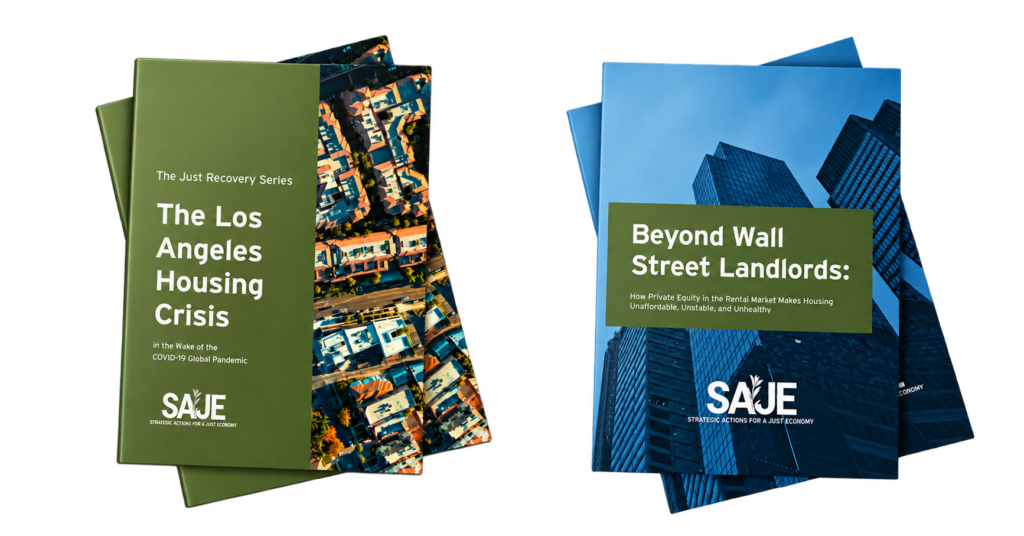
A shared palette, clear title hierarchy, and SAJE’s existing identity connect the publications. Cover photography and title placement respond to each subject, giving the reports a recognizable relationship without forcing the same composition.
EDITORIAL STRUCTURE
A flexible editorial framework.
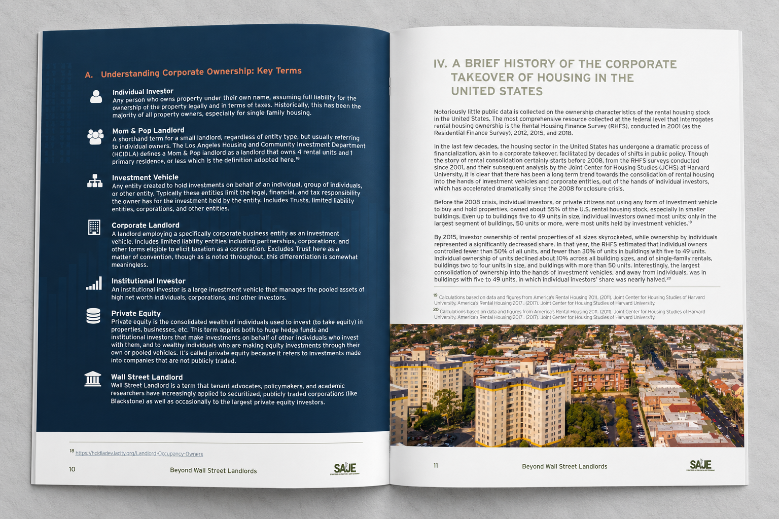
Section headings, body copy, source notes, and running footers establish a consistent reading order. Within that structure, the layouts make room for definitions, photography, maps, and diagrams.
Editorial system / Anatomy & variation
A flexible grid for complex research.
A consistent hierarchy gives readers a clear route through the research. Different page structures create room for introductions, detailed analysis, and visual evidence.
01 / Type hierarchy
AaAaAa
Distinct levels for section titles, supporting headings, and sustained reading. Hierarchy illustration; not a font specimen.
02 / Spacing rhythm
Keep related content close. Use larger intervals to separate sections and introduce a new topic.
03 / Color roles
SAJE’s existing palette connects the series and provides accents for headings, figures, and emphasis.
01 / Section opener
THE JUST RECOVERY SERIES
Section
heading 1
heading 1
PHOTOGRAPHY / IMAGE AREA
02 / Analysis + evidence
THE JUST RECOVERY SERIES
Analysis heading 2
FIGURE / SUPPORTING EVIDENCE
Source notes / caption 3
2Adapt the content area. More compact headings and parallel text areas leave space for detailed analysis and supporting figures.
3Keep evidence connected. Captions and source notes sit beside the figure, while the footer maintains a consistent navigation point.
Retrospective schematic diagrams explaining the report layouts; not original production files. Text lines, image areas, and chart bars are illustrative placeholders, not report content or data. Presentation approach informed by Wise Design’s Editorial Design System ↗.
INFORMATION DESIGN
Making complex research navigable.
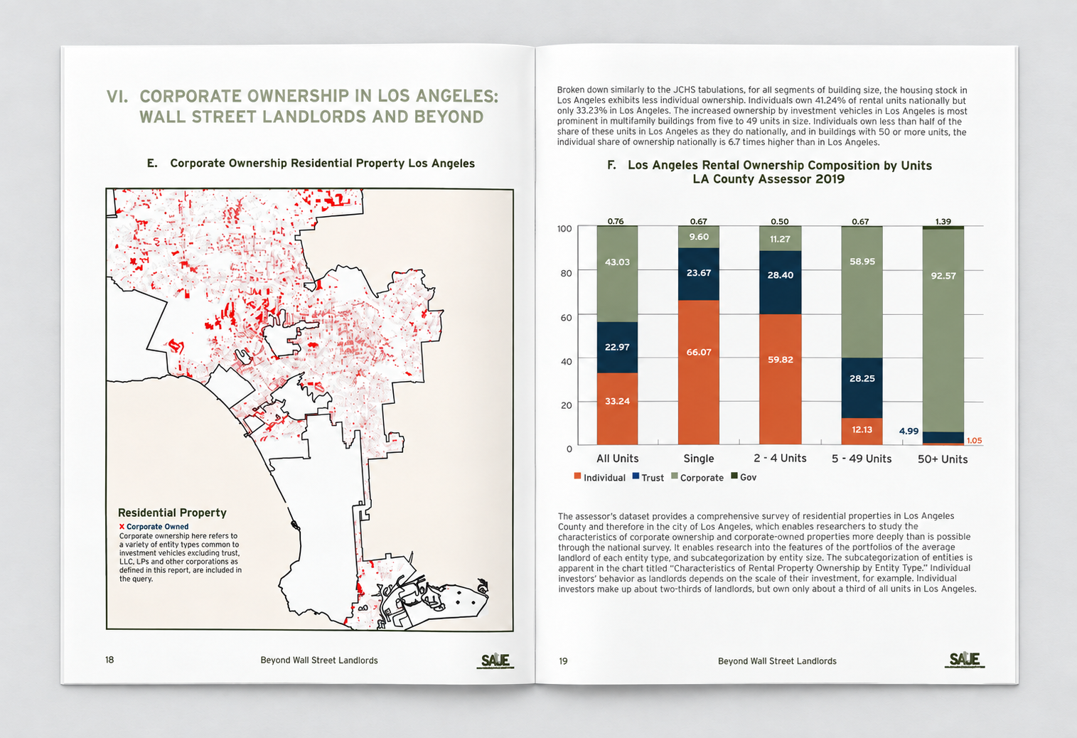
Maps and charts supplied by SAJE and its research contributors bring patterns into focus. My editorial work integrates these graphics with the surrounding analysis, using placement, spacing, and clear hierarchy to connect the evidence to the narrative.
NARRATIVE & EVIDENCE
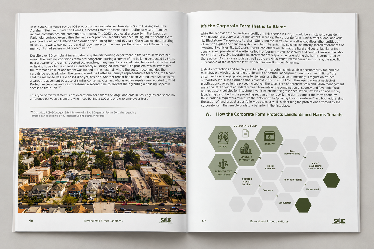
Photography and diagrams, within one structure.
Neighborhood photography connects the research to place. Diagrams give readers another way into the argument, alongside the detailed analysis and citations.
Outcome / Publications & continued relevance
A connected family of research publications.
A shared editorial language brings consistency to complex research. Typography, color, and hierarchy connect the series, while flexible layouts make room for analysis, photography, maps, and charts.
Relevance beyond publication
Both reports remain available in SAJE’s research archive. Referenced by SAJE in 2025SAJE cited Beyond Wall Street Landlords in its coverage of tenant organizing, demonstrating the research’s continued relevance.
Read SAJE’s 2025 article ↗Design
Brendan McNamara — The Los Angeles Housing Crisis.
Research & source figures
SAJE and contributing researchers. Editorial design builds on SAJE’s existing visual identity.