Expertise
UX Research
Information Design
Responsive UX
Project Details
Role: UX Designer & Researcher
Timeframe: 14 Days
Collaboration
SC Media stakeholders
CRA Data & Analytics


A UX case study on how behavioral data, hierarchy, and clearer interaction cues reshaped a multi-audience awards experience.
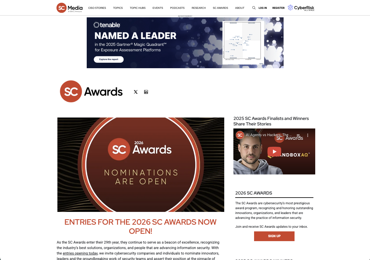
The SC Awards page had a familiar UX problem: the information was there, but users were not reaching it in the right order.
Vendors, practitioners, judges, sponsors, and returning participants all arrived with different goals. The page needed to answer several questions quickly: What are the awards? Am I eligible? When is the deadline? How do I participate?
Behavioral data showed that the experience was making those answers harder to find than they needed to be.
Expertise
UX Research
Information Design
Responsive UX
Project Details
Role: UX Designer & Researcher
Timeframe: 14 Days
Collaboration
SC Media stakeholders
CRA Data & Analytics
What this project demonstrates
How might we
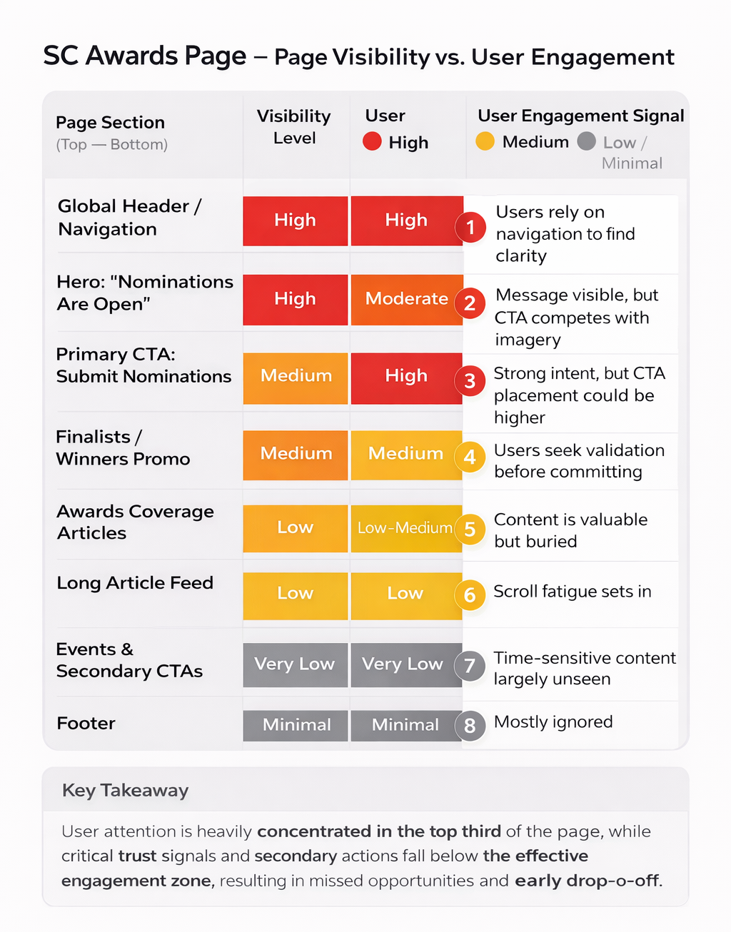
I started by separating content quantity from information order. Three behavioral signals stood out, showing a mismatch between visual hierarchy and user intent.
3%+
A paragraph captured more than 3% of clicks, showing that its styling suggested functionality where none existed.
~60%
Nearly 60% of visitors did not scroll far enough to see critical participation information.
NAVIGATION SIGNAL
Heavy dropdown use suggested that users were relying on navigation to answer questions the page itself should have resolved.
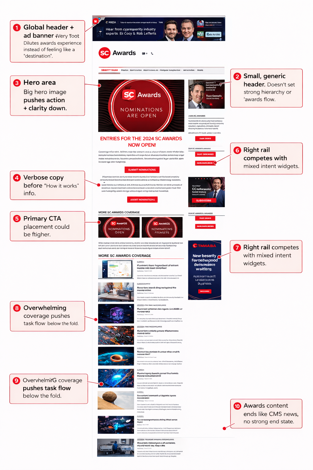
People were clicking text that was never meant to be clicked.
That sounds minor, but every false click creates a moment where the interface teaches users not to trust what looks interactive.
The behavioral data gave me a clear design rule: actions needed to look unmistakably actionable, and explanatory copy needed to look unmistakably passive.
The original experience asked users to invest attention before it had earned it. Deadlines, eligibility, and participation paths needed to appear earlier—before users had to decide whether to keep scrolling.
Design response: front-load urgency and decision-making information, then reveal supporting detail progressively.
Users had found a way through the experience—but that did not mean the experience was working well.
Heavy use of dropdown navigation suggested that visitors were leaving the page to hunt for answers. A workaround can look like engagement in analytics, even when it is actually evidence that the primary flow is underperforming.
Design response: structure the page around what people came to do—nominate, judge, review, learn—rather than around the internal structure of the content.
The solution was less about adding and more about reordering.
The redesigned experience brought high-value decisions forward while keeping supporting detail available for users who wanted to go deeper.
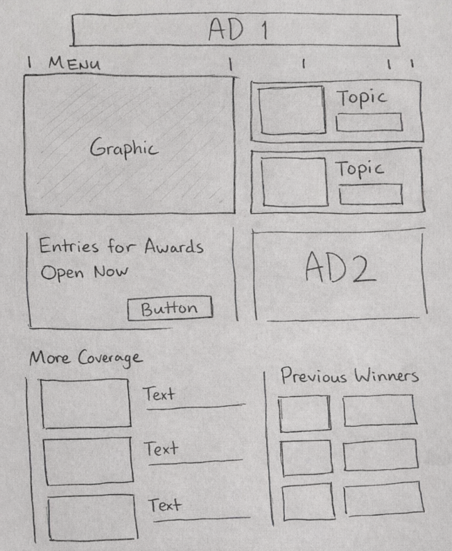
The final direction created a clearer framework for participation: next steps were easier to understand, interaction cues were more explicit, and the structure aligned more closely with the questions users were actually trying to answer.
User feedback also showed that visitors wanted immediate confirmation of how the awards process worked before committing. A concise How It Works explanation and clearer CTA labels were moved higher in the experience to answer that question sooner.
Most importantly, the redesign gave the page a clearer job: help someone understand where they belong and what they should do next.
This project reinforced how useful behavioral data can be when paired with a focused heuristic review. Misclicks, shallow scroll depth, and navigation use each looked small in isolation. Together, they revealed a much clearer story about hierarchy and user confidence.
If the work continued, the next step would be validating the revised hierarchy with participants across the major audience types and measuring whether more users reach and begin the intended participation flow.
Key takeaway
When users repeatedly leave a page to find the answer somewhere else, the navigation may be working—but the page is not. Behavioral data helped turn that subtle signal into a concrete design direction.