Using behavioral data and UX research to make the SC Awards experience clearer, more trustworthy, and easier to navigate for multiple audiences.
3%+
Clicks on non-interactive text
~60%
Didn’t reach essential information
5
Core audience groups
14 Days
Research + redesign sprint
01 · OVERVIEW
Project Overview
The SC Awards serve vendors, practitioners, judges, sponsors, and returning participants.
The content users needed was present, but behavioral data showed that hierarchy and interaction cues were making key information harder to find than it needed to be.
My role was to turn those behavioral signals into a clearer information hierarchy, stronger interaction cues, and a more direct path to participation.
Role
UX Designer & Researcher
Timeline
14 Days
Collaboration
SC Media stakeholders
CRA Data & Analytics
Methods
Heuristic review
Behavioral data
Heatmap analysis
02 · THE CHALLENGE
The right information was there — but users weren’t finding it.
Visitors arrived with different goals, but the page did not establish a clear order of importance.
People clicked text that was not interactive, many never reached participation details, and navigation became a workaround for questions the page itself should have answered.
The core UX problem was sequencing, hierarchy, and confidence—not missing content.
03 · PROCESS
From behavioral signals to design priorities
Behavioral data showed where users were struggling.
I paired those signals with a focused heuristic review, translated them into design priorities, and reorganized the experience around user intent.
1
Discover
Behavioral data, heatmaps, stakeholder context.
2
Define
Identify hierarchy, interaction, and navigation issues.
3
Design
Rework information order, CTA clarity, and page flow.
4
Validate
Review the direction and prepare the redesign.
WIREFRAME EXPLORATION
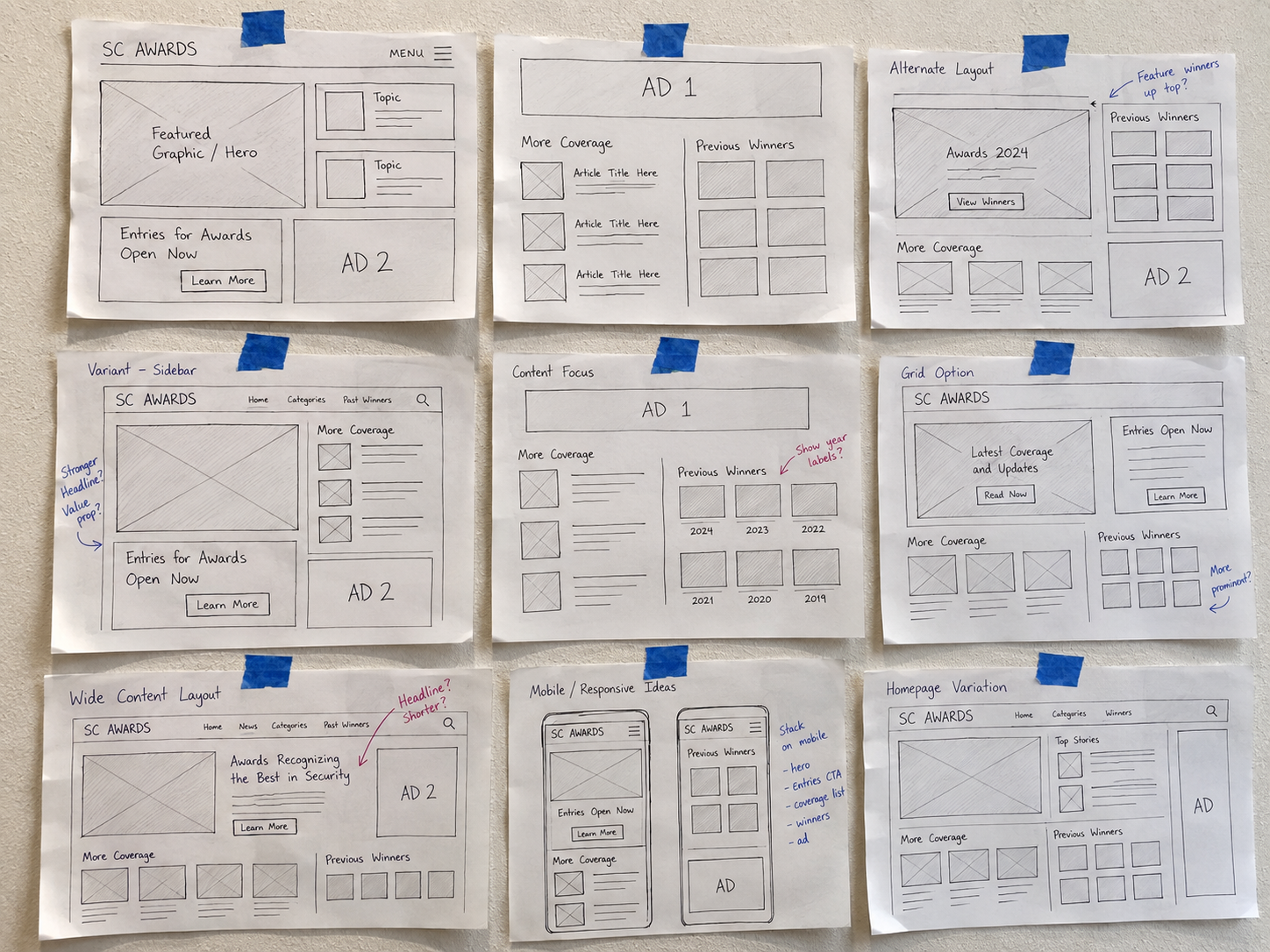
Discovery sketches / Hand-drawn exploration of the SC Awards page structure.
Desktop and mobile studies explore the hierarchy, nomination actions, and supporting awards content.
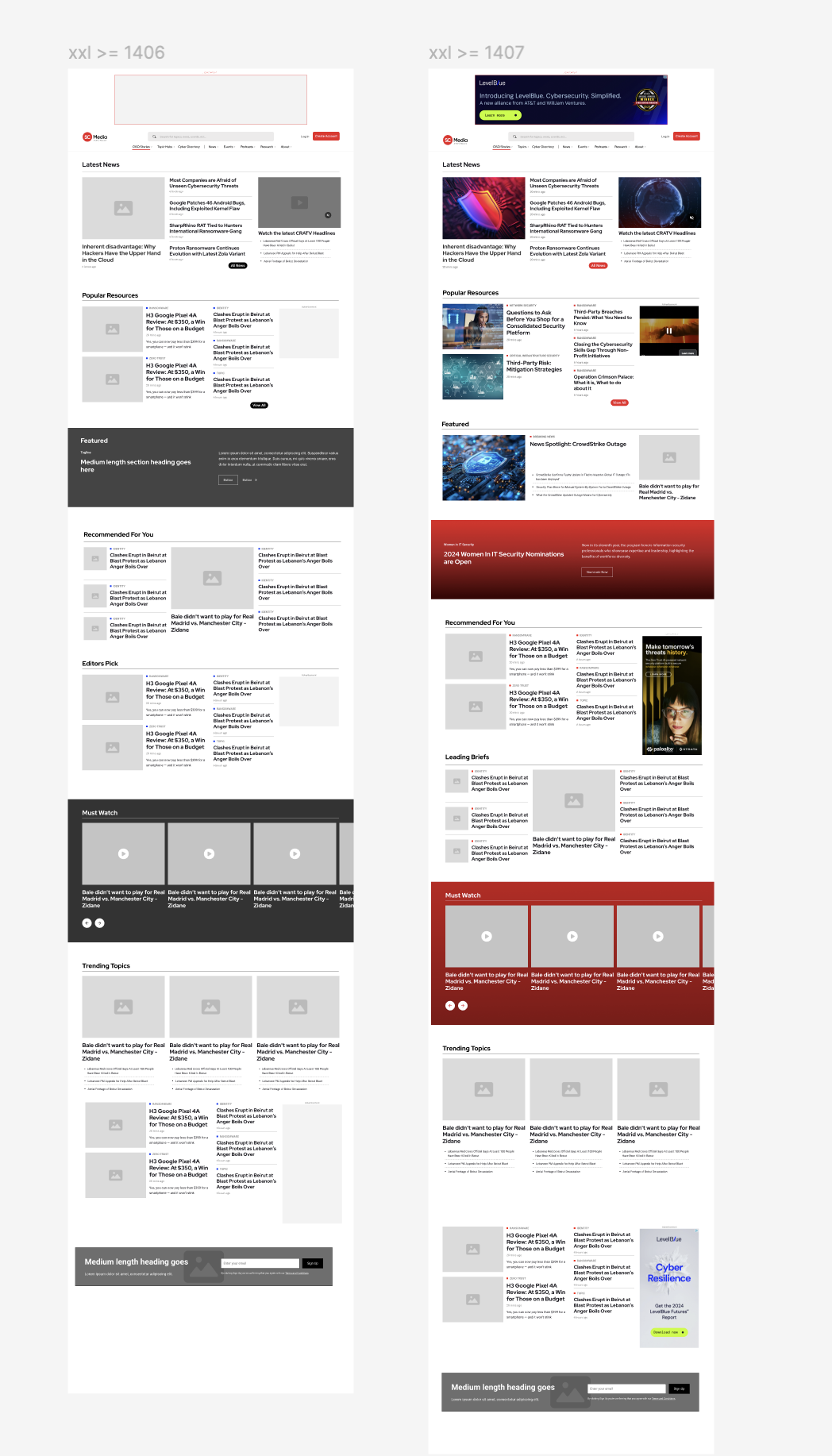
Desktop / Establish the next stepThe hero pairs the awards introduction with nomination and category actions. News, finalists, and categories follow in distinct groups. Open desktop layout
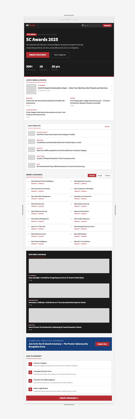
Mobile / Follow the page flowA single-column study shows how the awards content continues below the hero. Scroll inside the preview to explore the layout. Open full mobile wireframe
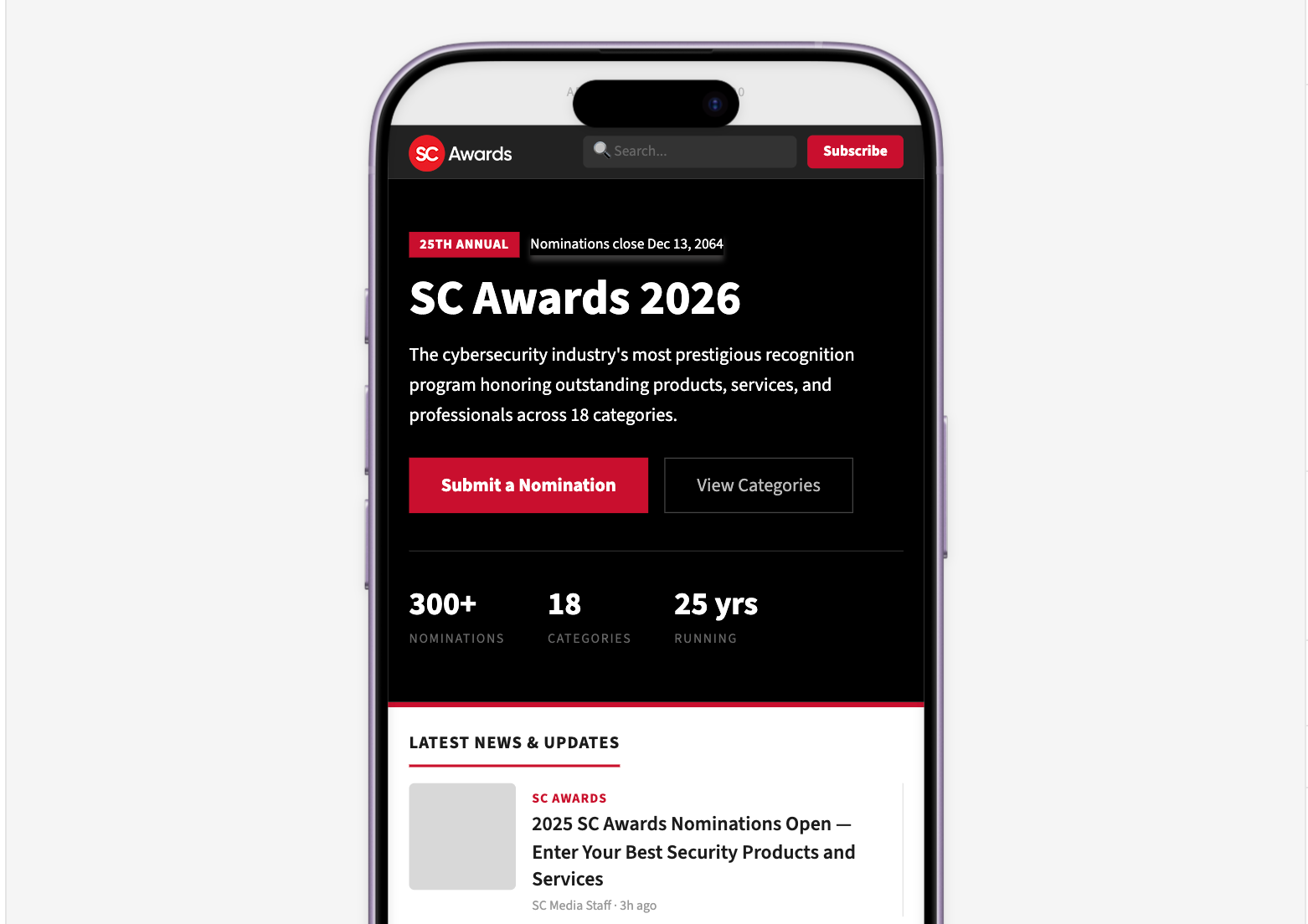
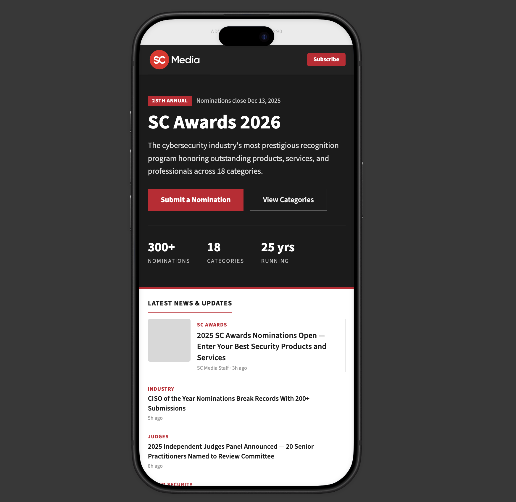
Mobile detail / Keep actions prominentThe phone mockup brings the nomination deadline, primary action, and category link into the opening screen. Open mobile detail
Design studies shown for layout and hierarchy. Dates, counts, and news content within the mockups are illustrative.
04 · KEY FINDINGS
Three signals pointed to the same underlying issue.
The page was making users work too hard to understand what mattered and what to do next.
FINDING 01
False affordances were undermining trust
People were clicking explanatory text that looked interactive, creating small moments of confusion.
EVIDENCE
3%+
Clicks landed on non-interactive text.
DESIGN RESPONSE
Make actions visibly actionable and passive content clearly non-interactive.
FINDING 02
Important information arrived too late
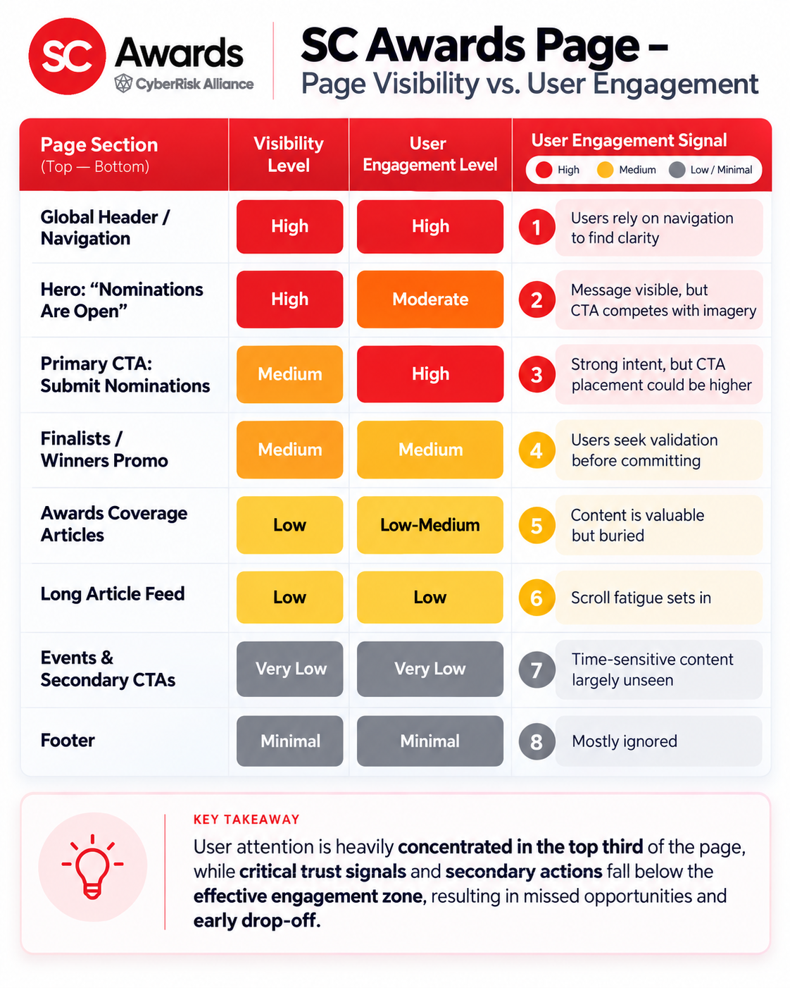
Critical participation details were positioned too far down the page, after many users had already stopped scrolling.
EVIDENCE
~60%
Visitors did not scroll far enough to reach essential information.
DESIGN RESPONSE
Move deadlines, eligibility, and next steps earlier in the experience.
FINDING 03
Navigation had become the workaround
Visitors were relying on dropdown navigation to answer questions that should have been resolved within the page itself.
EVIDENCE
Heavy navigation use indicated that the primary page flow was not supplying enough context.
DESIGN RESPONSE
Structure the page around user intent—nominate, judge, review, learn—rather than internal content structure.
05 · THE REDESIGN
A clearer path to participation
The redesign focused less on adding content and more on reordering it.
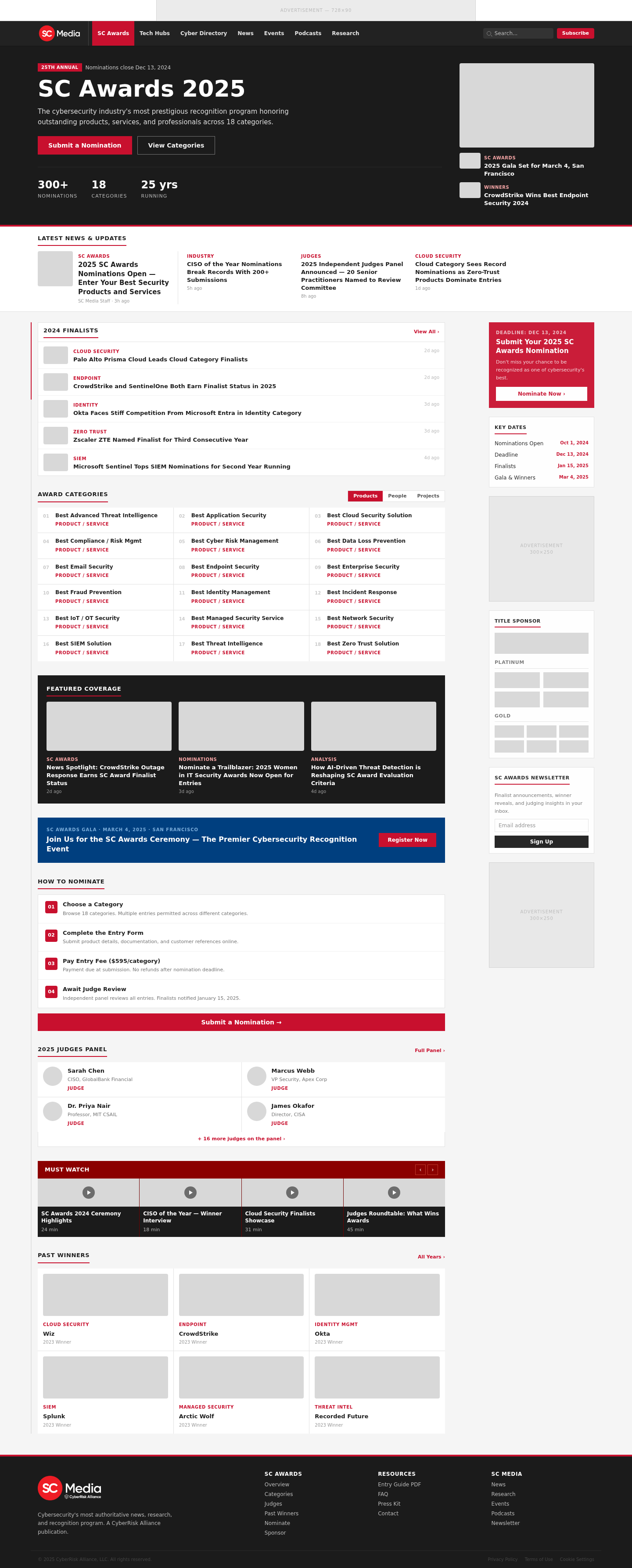
High-value decisions moved forward, actions became clearer, and supporting detail was revealed progressively.
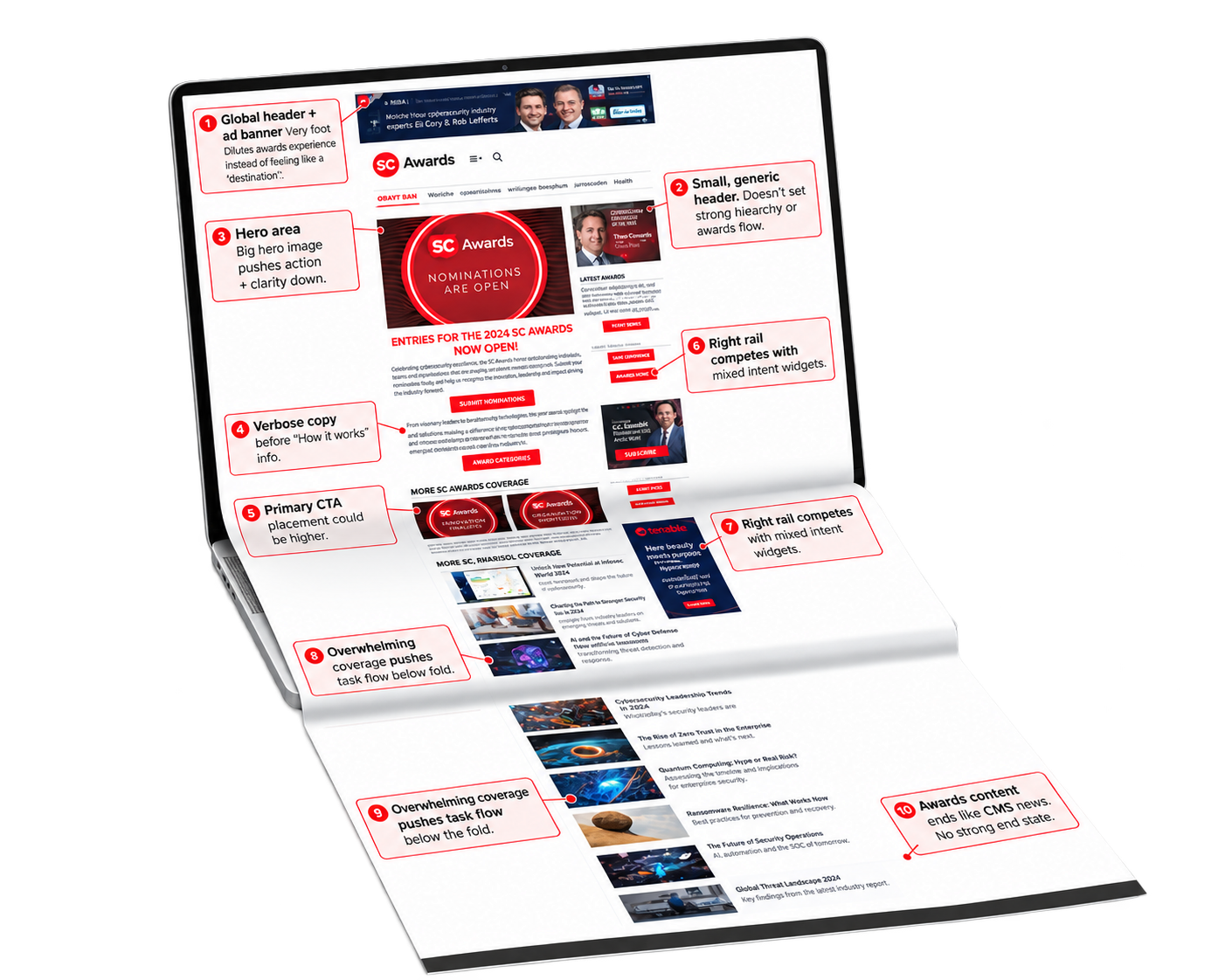
BEFORE / RESEARCH
AFTER / DESIGN DIRECTION
06 · OUTCOME
A clearer framework for participation
The redesign established a clearer participation path, stronger hierarchy, and more explicit interaction cues.
Because this project did not include a measured post-launch conversion result, the outcome should be read as directional rather than quantitative.
OUTCOME SUMMARY
The page gained a clearer job: help each visitor understand where they belong and what to do next.
A concise How It Works explanation and clearer CTA labels were moved higher so visitors could understand the awards process earlier.
07 · REFLECTION
What I learned
Small behavioral signals became meaningful when viewed together.
Misclicks, shallow scroll depth, and navigation use collectively revealed a clearer story about hierarchy and user confidence.
If the work continued, the next step would be validating the revised hierarchy across the major audience types and measuring whether more users reach the intended participation flow.
FINAL TAKEAWAY
A workaround is not the same thing as a good user experience.