Color as a brand cue
The green and orange event identity provides continuity, while individual campaigns introduce location-specific palettes.


Regulatory Compliance Watch / Brand design
Extending an established editorial brand into a cohesive identity for conferences, print, and digital experiences.
The challenge
IAWatch needed a consistent visual presence across its publication, conference series, sponsorship materials, and digital touchpoints. The challenge was to extend an established identity while allowing each event to remain distinct.
My work focused on brand application: carrying the recognizable IAWatch name, typography, and color language into layouts that could adapt to different audiences, locations, and formats.
01 / Visual identity
The green and orange event mark provides a recognizable anchor. Across the wider series, the IAWatch name and repeated information hierarchy connect individual event identities.
My contribution was translating those brand cues into usable compositions, balancing continuity with the practical needs of conference promotion and sponsorship communication.
The green and orange event identity provides continuity, while individual campaigns introduce location-specific palettes.
The contrast between the bold “IA” and lighter “Watch” gives the name a clear visual signature across applications.
Repeated relationships between brand, event title, practical details, and action keep different formats connected.
02 / Brand applications
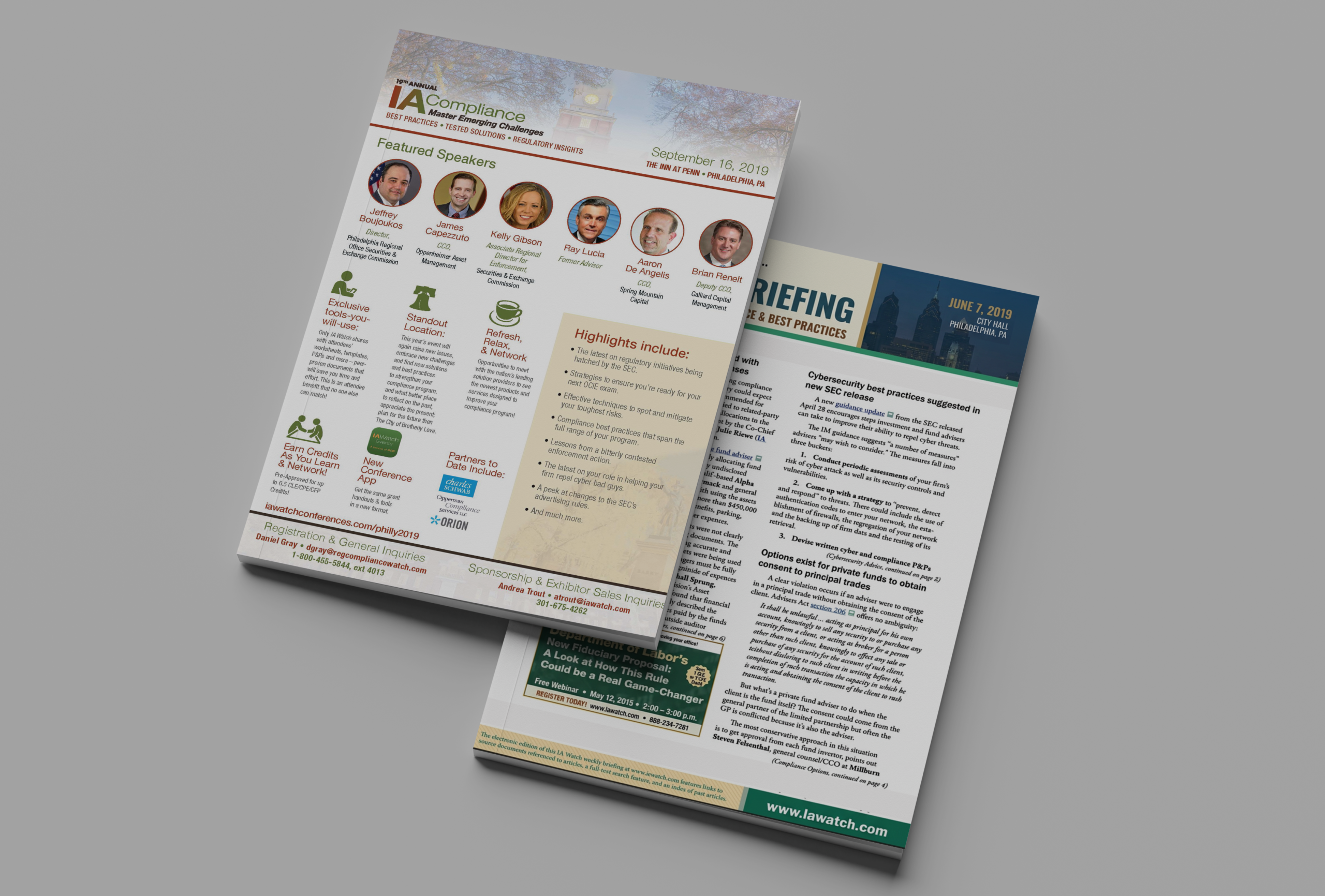
Shared title treatments and clear registration messages connect the conference series. Location photography and individual color palettes distinguish each event while keeping essential information prominent.


The conference name anchors the composition, followed by the program theme and supporting information.
Dates and venues have dedicated space, keeping practical information separate from promotional copy.
Contrasting registration bands bring the call to action and destination together.
03 / Print & sponsorship
The print materials bring speaker information, program benefits, and sponsorship opportunities into a consistent conference presentation.

The sponsorship overview brings multiple events together, giving each its own title, date, and venue within a repeated layout.
That structure allows the individual conferences to remain recognizable while presenting the broader program as one connected offering.

04 / Digital brand application
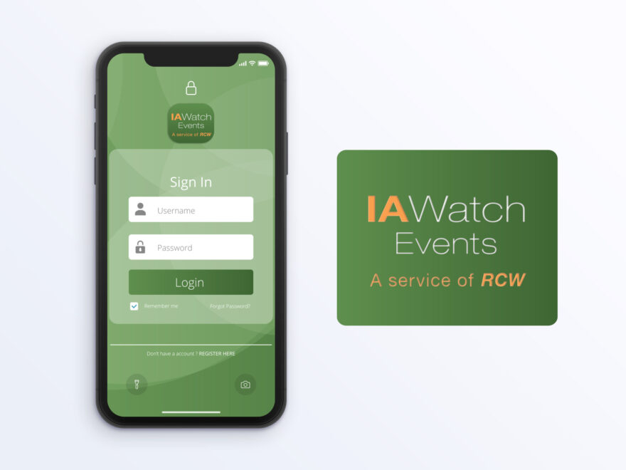
The IAWatch Events identity extends into the app sign-in presentation, using the green palette and event mark to connect the digital touchpoint to the wider conference brand.
Delivery
The project extended IAWatch’s established identity across conference campaigns, sponsorship collateral, editorial promotions, and digital branding.
My contribution covered layout, typography, image selection, and adaptation across the selected formats shown here.